Websites
What makes a business website genuinely useful?
A practical checklist for creating a clear website that helps visitors understand a service and take the right next step.
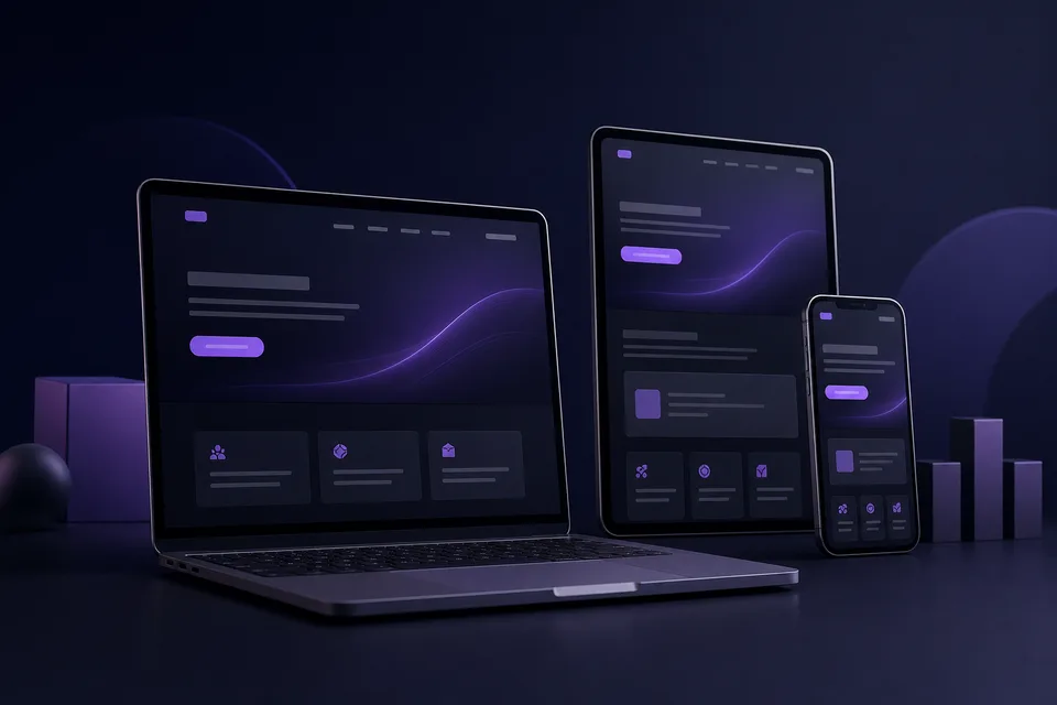
A professional website should do more than look polished. It should help the right visitor understand what the organisation offers, decide whether it is relevant and complete an appropriate next action with confidence.
Explain the service in the visitor’s language
Internal terminology can make sense to a team while remaining unclear to a potential customer. Headings and opening paragraphs should describe the problem being solved, who the service is for and what someone can expect.
Make important routes obvious
Navigation should reflect the questions visitors are likely to have. Service details, evidence, pricing information where appropriate, contact options and legal information should not require guesswork.
Each important page should also provide a sensible next step. That might be reading a related service, viewing a relevant project or making an enquiry.
Ask only for useful enquiry information
A contact form should be easy to complete and collect only what is needed to understand and reply to the request. Clear labels, useful error messages and confirmation after submission are part of the service experience.
Design for accessibility and different devices
Readable text, visible keyboard focus, labelled controls, sufficient colour contrast and a logical heading structure help more people use the site. Responsive layouts should preserve clarity rather than simply shrink the desktop version.
Keep performance and maintenance practical
Large decorative media, unnecessary scripts and complicated effects can slow a site without improving the customer journey. A focused website is easier to maintain, test and update as the organisation changes.
- Review service information regularly
- Test forms and important links
- Check pages on mobile and with a keyboard
- Remove outdated claims and duplicated content
A useful website combines clear information, accessible interaction and an obvious next step. Visual design supports those goals; it should not distract from them.